As a Graphic Designer i have been provided with the opportunities of working on logo design for several entities, below are some examples of logo design i have done in the past.
Rainmaker Marketing branding
Identity project designed for a Marketing Automation Company in Colorado, in collaboration with Carbon 8 Marketing.
I was hired by Carbon 8 Marketing in Denver, to design a logo and business card for a marketing automation company called Rainmaker. This company is serious in tone so a minimal look was needed, and an upside down umbrella is used as a symbol to represent the ongoing rain that symbolizes prosperity.
The lettering for the word Rainmaker was custom designed to make the brand unique, using a slab serif font as a reference.


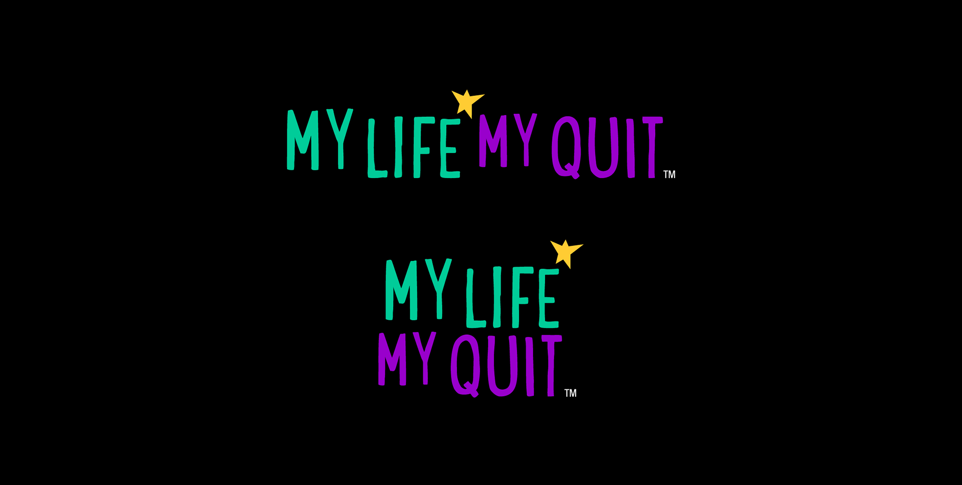
My Life My Quit
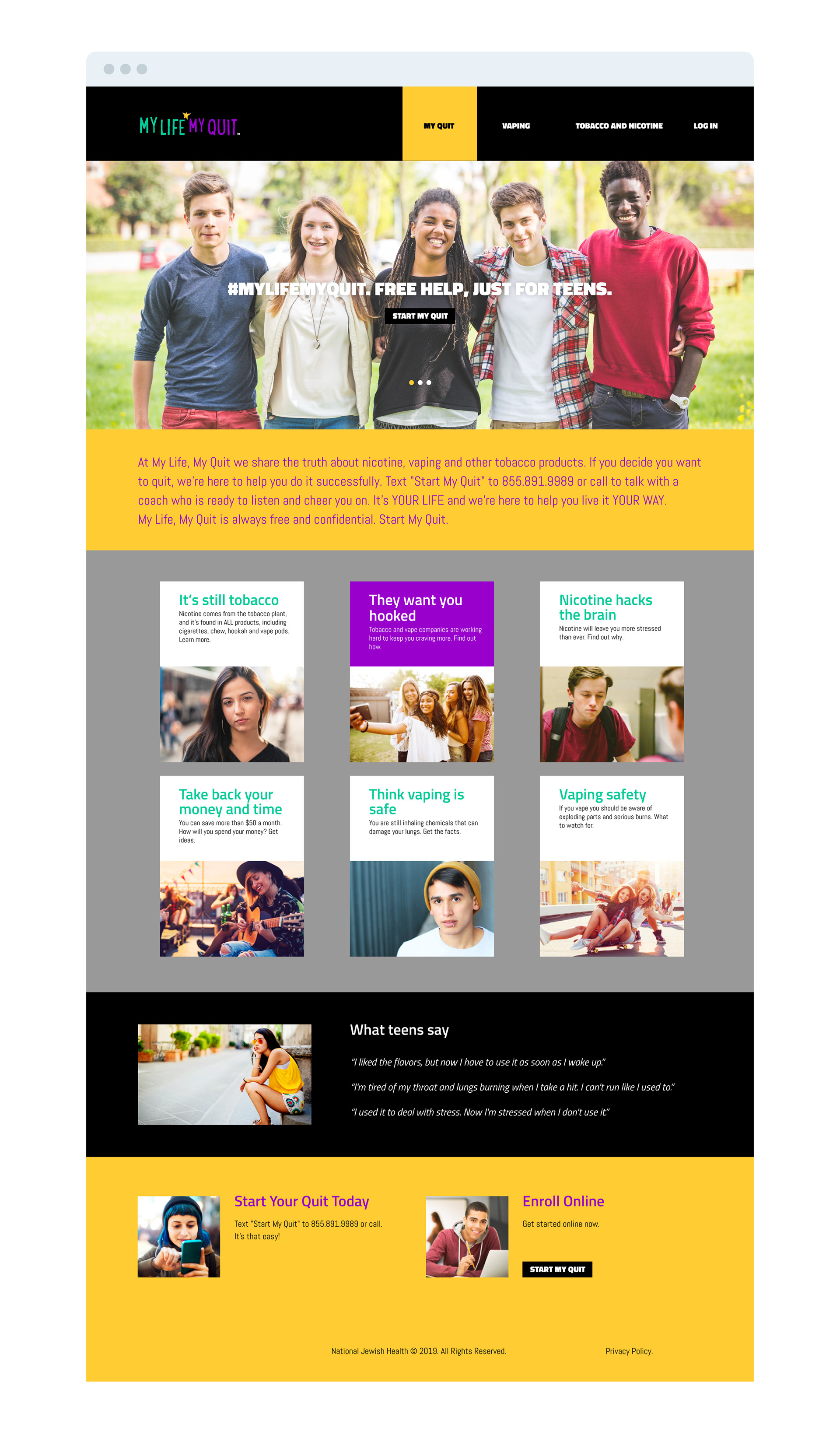
The National Jewish Health Organization provides several rehabilitation programs to help their patients with addiction problems. As part of their efforts they launched a campaign to focus on helping teenagers into recovering from tobacco and vaping addiction, this campaign was a web and social media driven effort to provide information about vaping addiction and how to get help. I was given the opportunity to collaborate in working on the design of the identity of the campaign, defining the look and feel and using those branding elements into the deliverables that were needed such as website design, digital advertising and social media.
For the look and feel i used a star that resembles a person raising its arms symbolizing happiness, health and freedom, it tells a story of the outcome of rehabilitation which is the promise of this program. I also used a handwritten font and a colorful palette that is catered to young people seeking help.

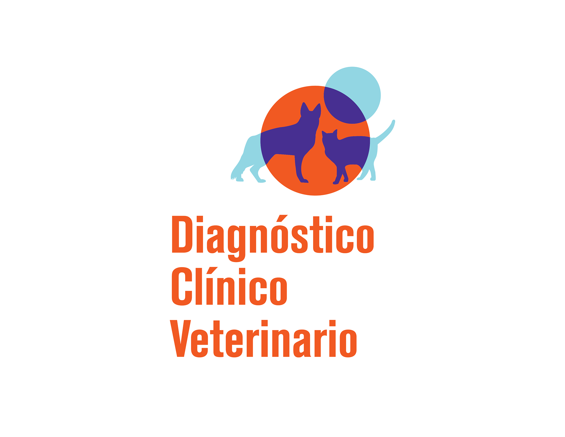
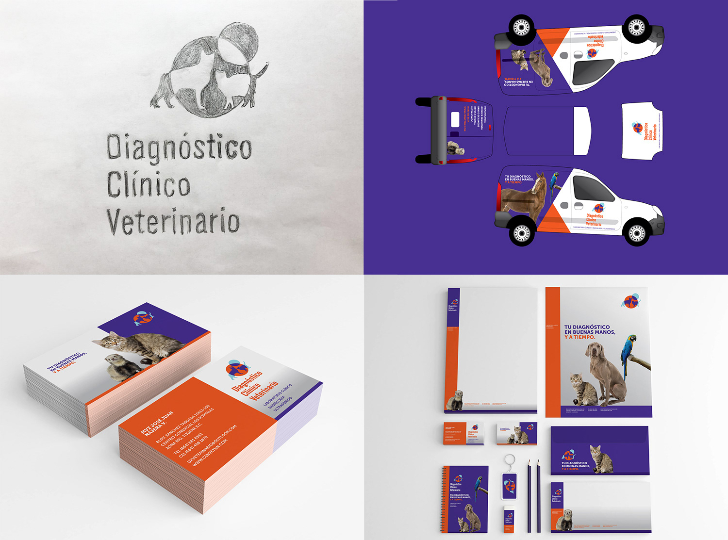
Diagnóstico Clinico Veterinario
I was hired for the design of this branding project for a Veterinarian Laboratory. This establishment is B2B type and its catered to vet doctors to have x-rays, ultrasound, and blood tests done for their clients pets, with the best technology and service available. I created a symbol that represents a microscopic view of a cell, with silhouettes of a dog and a cat using a transparency effect highlighting a part of the animals bodies to symbolize the x-ray occupation. For the lettering i chose Akzindens Grotesk because its condensed style makes a long name look good on any media, and it offers the versatility of making it work on three, two or one line if necessary. The result is a clean and minimalistic visual solution that accurately represents what the company does, and speaks well of their services.
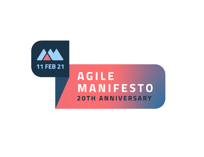
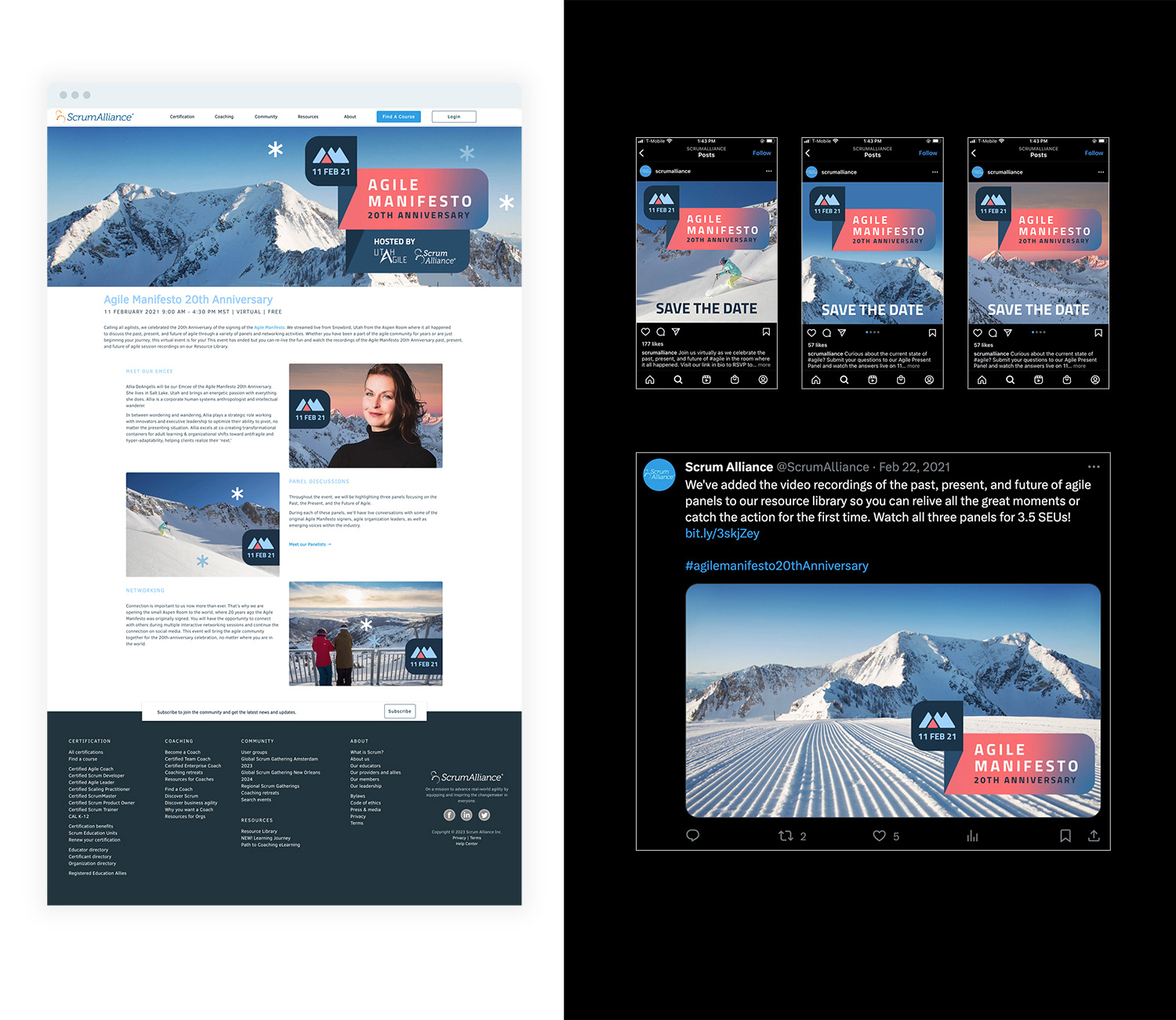
Agile Manifesto 20th anniversary event
During my time working at Scrum Alliance i was assigned to design a logo for an Agile event called Agile Manifesto as well as digital banners for web and social media. The event took place in the mountains at The Lodge at Snowbird ski resort, the stakeholders wanted a look and feel that brings the style of snow sports while keeping a clean style that looks contemporary.